Trade press slows down in July and August. Editors are traveling, print calendars close early for fall issues, and the news cycle thins out. That makes summer a useful test: when there's less competing for attention, what still gets covered says something about what a pitch needs to work at any time of year.
This summer, a few placements stood out.
Fancy Walls and the pop culture angle. Instead of pitching a new wallpaper collection on pattern and colorway alone, the pitch tied designs to shows and characters people already had opinions about, referencing The White Lotus, Legally Blonde, Bridgerton, and Spider-Man as mood references rather than licensed tie-ins. Editors don't need another product roundup. They need a hook their readers will click on, and "this wallpaper has main character energy" is a hook.
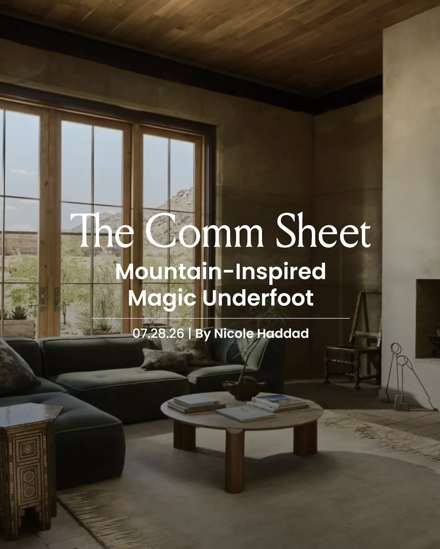
Tai Ping / Edward Fields. The Comm Sheet featured Tai Ping's Sierra collection, five hand-knotted patterns drawing on Sierra Nevada landscapes, from granite peaks to snowmelt streams. The coverage got specific: the hand-dyed abrash effect in Juniper I in Madder, the Chinese silk border on Conifer. That level of detail is what separates a placement from a mention.
Rugs USA. A placement in Homes & Gardens built around a seasonal trend story rather than a straight product feature, which gave the outlet something to hang a roundup on.
The pattern underneath all three
None of these pitches led with the product. They led with a reason to care: a cultural reference, a real building, a real use case. That's not a summer-specific trick. It's just more visible when there's less noise to hide behind.
What this means going into fall
If a pitch only works when the news cycle is quiet, it's not strong enough to survive September. The brands that placed well this summer weren't lucky. They had a story an editor could hand to their readers without having to do the translating themselves.
That's the bar for the rest of the year too.